Interactive plotting with bokeh#
Steven Pestana, November 2019
import numpy as np
import pandas as pd
import scipy.io as sio
import datetime as dt
matplotlib#
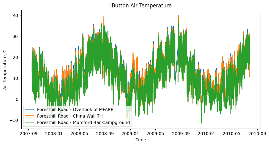
We can plot this with matplotlib, which most of you are very familiar with now
import matplotlib.pyplot as plt
%matplotlib inline
Use matplotlib to plot a timseries for a couple sites to compare their air temperatures#
# create a figure and specify its size
plt.figure(figsize=(10,5))

# select and plot a few sites use the site name as its label
for site in range(3):
    plt.plot(dates,AIR_TEMPERATURE[:,site],
             label=SITE_NAMES[site])

plt.legend(loc='lower left')                   # add a legend to the lower left of the figure
plt.ylabel('Air Temperature, C')               # set the label for the y axis
plt.xlabel('Time')                             # set the label for the x axis
plt.title('iButton Air Temperature');          # give our plot a title
It’s hard to see what’s going on in detail, so we’ll set x and y axes limits to “zoom in” (and apply some formatting to the legend).
# create a figure and specify its size
plt.figure(figsize=(10,5))

# select and plot a few sites use the site name as its label
for site in range(3):
    plt.plot(dates,AIR_TEMPERATURE[:,site],
             label=SITE_NAMES[site])

plt.legend(frameon=False,
           loc='lower center',
           labelspacing=0.5,
           title='Site Names')                 # add a legend and format
plt.ylabel('Air Temperature, C')               # set the label for the y axis
plt.xlabel('Time')                             # set the label for the x axis
plt.title('iButton Air Temperature');          # give our plot a title

# use xlim to set x axis limits to zoom in between two specific dates
plt.xlim(('2007-10-01', '2007-10-05'));

# use ylim to set y axis limits to zoom in between two specific temperatures
plt.ylim((0,25));
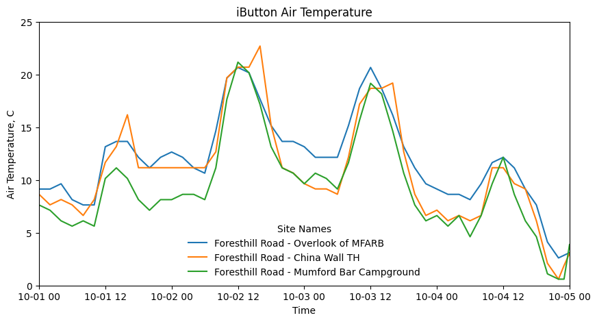
Now we can see the daily temperature fluctuations at these three sites and how they compare.
bokeh#
We can also create an interactive plot with the bokeh library. This is especially useful for exploring your data quickly, but perhaps less useful for producing figures for posters or publication.
from bokeh.plotting import figure, output_notebook, show
from bokeh.palettes import Category10
---------------------------------------------------------------------------
ModuleNotFoundError                       Traceback (most recent call last)
/tmp/ipykernel_2658/2563148453.py in <module>
----> 1 from bokeh.plotting import figure, output_notebook, show
      2 from bokeh.palettes import Category10

ModuleNotFoundError: No module named 'bokeh'
# output plot to notebook here
output_notebook()

# create a new plot with a title and axis labels
p = figure(title='iButton Air Temperature',
           x_axis_label='Time',
           y_axis_label='Air Temperature, C',
           height=400, width=650)

# select and plot a few sites use the site name as its label
for site in range(3):
    p.line(dates,AIR_TEMPERATURE[:,site],
           legend_label=SITE_NAMES[site],
           line_width=2,
           line_color=Category10[3][site])

# show the results
show(p)
Visualization libraries/tools for python:#
General and interactive plotting:
matplotlib large and well-supported plotting library
pandas + matplotlib matplotlib plotting methods with pandas dataframes
seaborn “statistical data visualization”
Geospatial data plotting:
geopandas geospatial data (good with point, line, polygon, vector data)
xarray for gridded data, timeseries, multi-dimensional arrays, NetCDF files (climate data example)
rasterio for raster data (images or other gridded data)
Geoviews interactive maps and geospatial data
Python data visualization tutorials:#
Start here - Software Carpentry: Plotting and Programming in Python
More detailed - Python Data Science Handbook: Visualization with Matplotlib
Making maps - Geohackweek: Geospatial Data Visualization